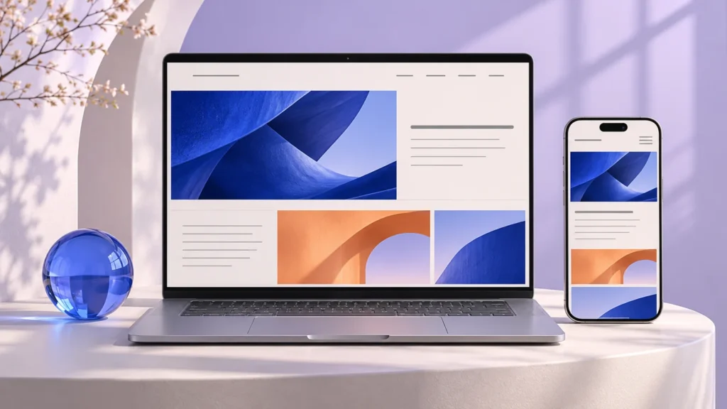
Improve the route from first impression to enquiry with clearer messaging, useful service information and a simpler mobile experience.
1. Explain what the business does immediately
A visitor should not need to scroll through decorative statements to understand your offer. Use a clear headline, a short explanation, and a next step. Your first screen can show personality while still answering the basic question: is this relevant to me?
Avoid trying to explain every service in the opening paragraph. Introduce the main proposition, then let the navigation and service sections guide visitors toward the information they need. A clear structure usually helps more than adding another slogan.
2. Give service pages a useful job
A service page should explain the problem addressed, the type of support available, who it is for, how work is approached, and what happens next. These details reduce uncertainty and help people decide whether to contact you.
Use headings that describe the content beneath them. Add evidence you can substantiate, and distinguish illustrative concepts from completed work. If a scope varies by business, explain what determines that scope rather than hiding behind broad claims.
3. Keep contact options visible and honest
A phone link, a working enquiry form, and a relevant messaging option can give visitors a choice. Use consistent contact information across the header, contact page, and footer. Make it clear whether a button submits a form or opens another application.
Ask for enough information to respond usefully, but do not add unnecessary fields. Show a confirmation that reflects what actually happened. An email transport accepting a message is different from proving it reached an inbox, and a prepared WhatsApp message still needs the visitor to press Send.
4. Review the experience on a real phone
Check text size, spacing, image crops, menu controls, form labels, and the ease of tapping buttons. A layout that technically fits a small screen can still feel difficult if the primary action is hidden or the content is crowded.
Test with a slower connection as well. Large unoptimized imagery can delay the first impression. Use appropriately sized files, reserve image space to reduce layout movement, and avoid loading every decorative asset before the visitor can read the page.
5. Use enquiry data to guide improvements
Start with a small number of questions you can answer reliably. Which pages lead to contact? Where do visitors struggle? Are enquiries relevant? What information do people keep asking for? The answers can help prioritize content and design changes.
Review website behavior alongside what your sales or front-desk team hears. Improving the enquiry journey is usually an ongoing process. Explore Digioker’s website design and development service or share your current website for an initial conversation.
Talk through your next step
Digioker is based in Prahlad Vihar, Rohini Sector 25, Delhi. Book a free initial consultation to discuss your business, current setup, and the work that could be most useful next.